
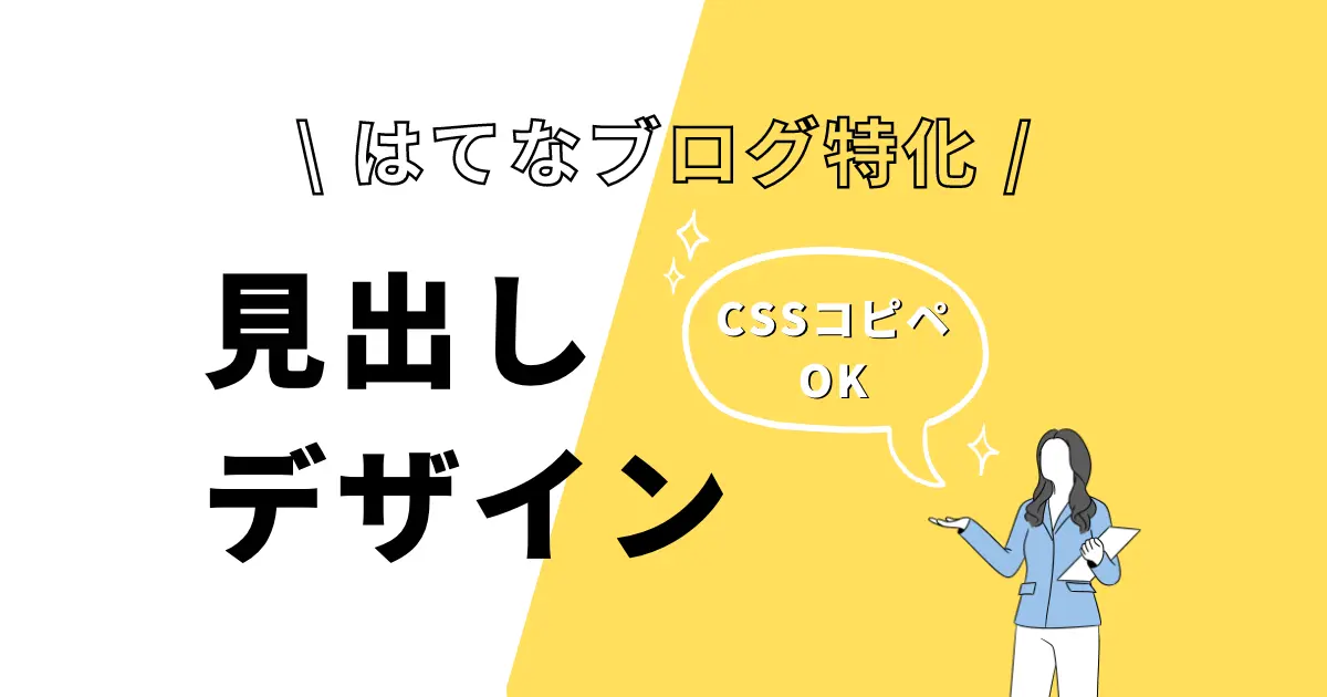
はてなブログの「見出し」をおしゃれにカスタマイズしたい!
良い感じの見出しデザインを紹介してくれないかな…
本記事ではそんなお悩みを解決します!
はてなブログの見出しデザインは、基本的に適用したブログテーマによって自動的に装飾されます。
しかし、「自分なりにカスタマイズしたい!」と思う方もいるでしょう。
そんな方に向けて、本記事では「はてなブログの見出しデザイン」についてまとめました。
 oi
oi本記事で分かることはこちらになります。
- はてなブログの見出しデザインについて
- 見出しデザイン24選
- おしゃれ・かわいいデザイン11選
- シンプル・ミニマルなデザイン13選
- デザイン例のCSS【コピペOKです】
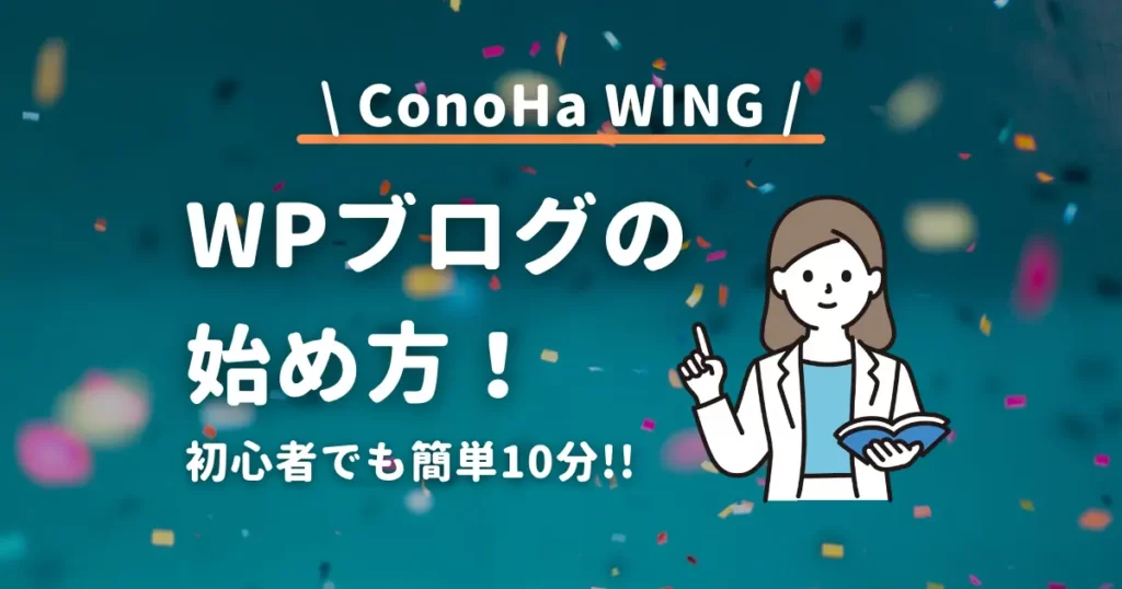
ConoHa WINGがキャンペーン中!
はてなブログからWordPressブログへの移行を検討している方にお得な情報です。
レンタルサーバーConoHa WINGでは、2025年2月6日(木)16:00まで以下のキャンペーンを実施中です!
\スタート応援キャンペーン/
- サーバー料金が最大約54%オフ!(通常月1,452円→660円)
- 独自ドメイン2つが永久無料(毎年の更新費用がずっと無料)
お得にブログを始められるチャンスです。キャンペーン詳細はこちらからご確認ください。
また、こちらの記事もおすすめです!

はてなブログの見出しデザインについて
はてなブログの見出しデザインをカスタマイズする前に、まずは理解を深めておく必要があります。
はてなブログとWordPressブログは少し仕様が異なるためです。
事前にしっかり抑えておきましょう。
はてなブログの見出しの種類
はてなブログで使用可能な見出しの種類は、以下の3つになります。
はてなブログの見出しの種類
- 大見出し
- 中見出し
- 小見出し
記事作成画面にて、3種類の見出しの中から好きなものを選択して使用することができます。
はてなブログの見出しに割り当てられているタグ
はてなブログの見出しには、以下のようにタグが割り当てられています。
はてなブログの見出しタグ
大見出し:h3タグ
中見出し:h4タグ
小見出し:h5タグ
これらのタグに対して「CSS」を記述することで、見出しデザインをカスタマイズすることができます。
次に、WordPressブログの場合を見ていきましょう。
WordPressブログの場合は以下のようにタグが割り当てられており、はてなブログとは少し異なります。
WordPressブログの見出しタグ
大見出し:h2タグ
中見出し:h3タグ
小見出し:h4タグ
はてなブログとWordPressブログを比較した表を作成しました。
| 見出しの種類 | はてなブログ | WordPressブログ |
|---|---|---|
| 大見出し | h3 | h2 |
| 中見出し | h4 | h3 |
| 小見出し | h5 | h4 |
oiこのように、はてなブログとWordPressブログはタグの番号が1つずれています。
上記のため、WordPress向けに書かれたCSSをそのままはてなブログで使用すると、正しく反映されない場合があります。
本記事に記載しているCSSは、「はてなブログ用にコーディングしたもの」となっていますのでご安心ください。
僕はWebとは無縁の仕事をしていますが、この本のおかげでHTML・CSSの基礎知識を身につけることができました。
「HTMLやCSSについてしっかり勉強したい!」と考えている方には、こちらの本がおすすめです。

 ポチップ
ポチップ
今では簡単なデザインであれば、自分で考えてコーディングすることができます。
はてなブログの見出しデザインをカスタマイズする方法
はてなブログの見出しデザインをカスタマイズする手順は以下の通りです。
- はてなブログ管理画面にアクセス
- 「デザイン」をクリック
- カスタマイズタブのデザインCSSにコードを追加
とても簡単なので、一度試してみましょう。
oi僕が考えたデザイン例のCSSコードは後ほどご紹介します。
デザインにこだわりたいならWordPressブログがおすすめ
もっとデザインに拘りたい!
そんな方には、WordPressブログをおすすめしています。
なぜかというと、WordPressブログには
- デザインが自由
- ハイクオリティのテーマが充実している
- はてなブログ有料会員のコストと大差がない
といったメリットがあるからです。
僕も元々はてなブロガーでしたが、デザインのカスタマイズ性に限界を感じてWordPressブログ(本ブログ)に移行しました。
詳細はこちらの記事にまとめています。
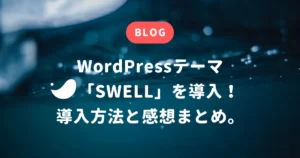
また、本ブログではWordPressテーマの「SWELL」を使用しています。
SWELLのおかげで、一切CSSを追記せずとも満足できるデザインにすることができました。
デザインカスタマイズ難民の方に非常におすすめです。
はてなブログの見出しデザイン24選!【CSSコピペOK】
本題です。以下のカテゴリごとに、見出しデザインを考えてみました!
- シンプル・ミニマル系
- おしゃれ・かわいい系
CSSをコピーできるようにしておいたので、好きなデザインを選んで「デザインCSS」にコピペしてもらえればOKです。
oiいろいろ試してみて、お気に入りのデザインを見つけて下さいね!
まずはリセットCSSを追記して下さい
まずは、以下のコードをデザインCSS欄に貼り付けてください。
コードを表示する
.entry-content h3 {
  border: none;
  background: none;
}これは、既存のデザインを一度リセットするためのコードになります。こちらを記述しないと、適用テーマのデザインと競合して、デザインが崩れてしまうことがあります。
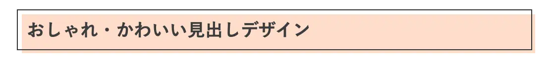
おしゃれ・かわいい見出しデザインCSS【11選】
おしゃれ・かわいいに特化した見出しデザインCSSです。
立体感のある四角
コードを表示する
.entry {
position: relative;
z-index: 1;
}
.entry-content h3 {
position: relative;
margin: 1.5em 0em;
border: 1px solid #333;
padding: 0.5em;
}
.entry-content h3::before {
content: "";
position: absolute;
top: 4px;
left: 4px;
width: 100%;
height: 100%;
background-color: #ffddcc;
z-index: -1;
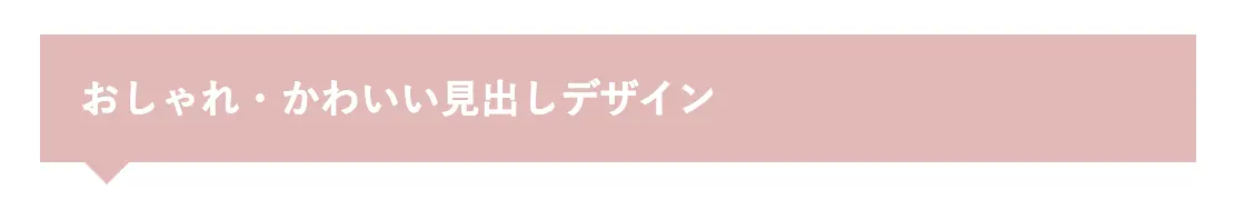
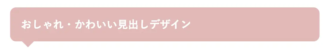
}四角いふきだし
コードを表示する
.entry-content h3 {
color: white;
position: relative;
background-color: #E1B8B6;
padding: 1em;
}
.entry-content h3:after {
content: '';
position: absolute;
top: 100%;
left: 20px;
border: 10px solid transparent;
border-top: 10px solid #E1B8B6;
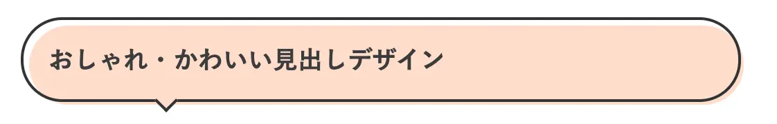
}立体感のある四角いふきだし
コードを表示する
.entry {
position: relative;
z-index: 1;
}
.entry-content h3 {
position: relative;
padding: 1em;
border: 2px solid #333;
}
.entry-content h3::before {
content: "";
position: absolute;
bottom: -7px;
left: 20%;
transform: translateX(-50%) rotate(-45deg);
width: 10px;
height: 10px;
border: 2px solid #333;
border-top: none;
border-right: none;
background-color: #ccf7ff;
}
.entry-content h3::after {
content: "";
position: absolute;
top: 4px;
left: 4px;
width: 100%;
height: 100%;
background-color: #ccf7ff;
z-index: -1;
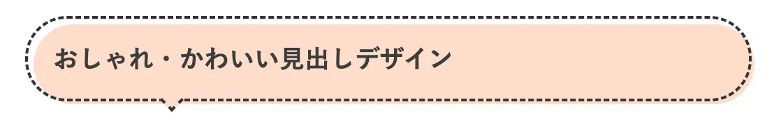
}立体感のある四角いふきだし(点線)
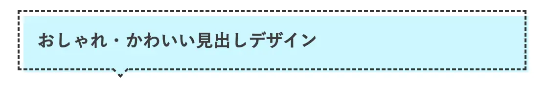
コードを表示する
.entry {
  position: relative;
  z-index: 1;
}
.entry-content h3 {
  position: relative;
  padding: 1em;
  border: 2px dashed #333;
}
.entry-content h3::before {
  content: "";
  position: absolute;
  bottom: -7px;
  left: 20%;
  transform: translateX(-50%) rotate(-45deg);
  width: 10px;
  height: 10px;
  border: 2px dashed #333;
  border-top: none;
  border-right: none;
  background-color: #ccf7ff;
}
.entry-content h3::after {
  content: "";
  position: absolute;
  top: 4px;
  left: 4px;
  width: 100%;
  height: 100%;
  background-color: #ccf7ff;
  z-index: -1;
}
丸いふきだし
コードを表示する
.entry-content h3 {
  color: white;
  position: relative;
  background-color: #E1B8B6;
  border-radius: 10px;
  padding: 1em;
}
.entry-content h3:after {
  content: '';
  position: absolute;
  top: 100%;
  left: 20px;
  border: 10px solid transparent;
  border-top: 10px solid #E1B8B6;
}
立体感のある丸いふきだし
コードを表示する
.entry {
  position: relative;
  z-index: 1;
}
.entry-content h3 {
  position: relative;
  padding: 1em;
  border: 2px solid #333;
  border-radius: 30px;
}
.entry-content h3::before {
  content: "";
  position: absolute;
  bottom: -7px;
  left: 20%;
  transform: translateX(-50%) rotate(-45deg);
  width: 10px;
  height: 10px;
  border: 2px solid #333;
  border-top: none;
  border-right: none;
  background-color: #ffddcc;
}
.entry-content h3::after {
  content: "";
  position: absolute;
  top: 4px;
  left: 4px;
  width: 100%;
  height: 100%;
  border-radius: 30px;
  background-color: #ffddcc;
  z-index: -1;
}
立体感のある丸いふきだし(点線)
コードを表示する
.entry {
position: relative;
z-index: 1;
}
.entry-content h3 {
position: relative;
padding: 1em;
border: 2px dashed #333;
border-radius: 30px;
}
.entry-content h3::before {
content: "";
position: absolute;
bottom: -7px;
left: 20%;
transform: translateX(-50%) rotate(-45deg);
width: 10px;
height: 10px;
border: 2px dashed #333;
border-top: none;
border-right: none;
background-color: #ffddcc;
}
.entry-content h3::after {
content: "";
position: absolute;
top: 4px;
left: 4px;
width: 100%;
height: 100%;
border-radius: 30px;
background-color: #ffddcc;
z-index: -1;
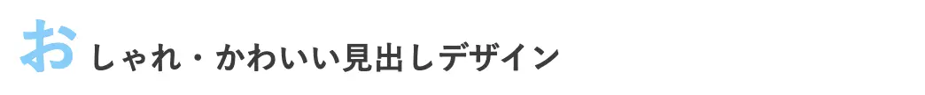
}1文字目を強調
コードを表示する
.entry-content h3::first-letter {
font-size: 2em;
color: #87cefa;
margin-right: 0.1em;
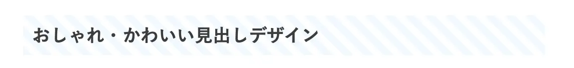
}ストライプ
コードを表示する
.entry-content h3 {
  background-image: linear-gradient(45deg, #f0f8ff 25%, transparent 25%, transparent 50%, #f0f8ff 50%, #f0f8ff 75%, transparent 75%, transparent);
  background-size: 20px 20px;
  padding: 0.5em;
}
中央に丸いマーク
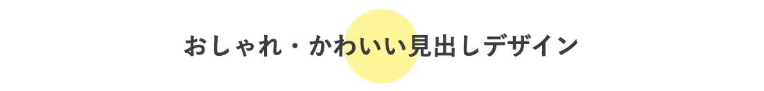
コードを表示する
.entry {
  position: relative;
  z-index: 1;
}
.entry-content h3 {
  position: relative;
  text-align: center;
  margin: 1em 0em;
}
.entry-content h3::before {
  content: "";
  position: absolute;
  top: 50%;
  left: 50%;
  transform: translate(-50%, -50%);
  width: 3em;
  height: 3em;
  background-color: #fff599;
  border-radius: 50%;
  z-index: -1;
}
左端に丸いマーク
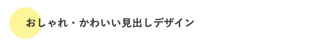
コードを表示する
.entry {
position: relative;
z-index: 1;
}
.entry-content h3 {
position: relative;
margin: 1.5em 0em;
}
.entry-content h3::before {
content: "";
position: absolute;
top: 50%;
left: 0%;
transform: translate(-50%, -50%);
width: 3em;
height: 3em;
background-color: #fff599;
border-radius: 50%;
z-index: -1;
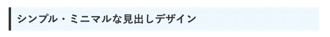
}シンプル・ミニマルな見出しデザインCSS【13選】
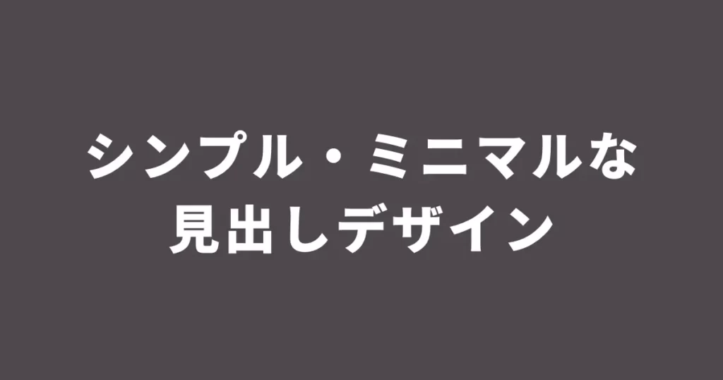
シンプル・ミニマルに特化した見出しデザインCSSです。
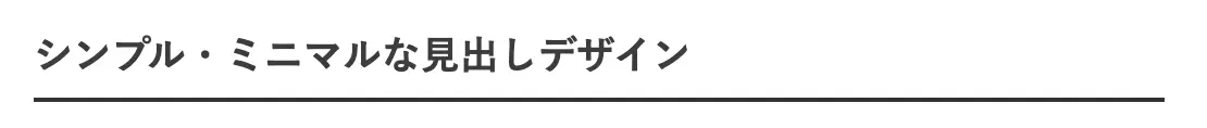
上下にボーダーライン
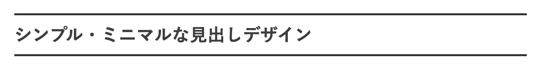
コードを表示する
.entry-content h3 {
  border-top: 2px solid #333;
  border-bottom: 2px solid #333;
  padding: 0.5em 0;
}
下のみボーダーライン
コードを表示する
.entry-content h3 {
  border-bottom: 2px solid #333;
  padding: 0.5em 0;
}
下のみに2色のボーダーライン

コードを表示する
.entry-content h3 {
  position: relative;
  padding: 0.5em;
}
.entry-content h3::before,
.entry-content h3::after {
  content: "";
  position: absolute;
  bottom: 0;
  left: 0;
  height: 2px;
}
.entry-content h3::before {
  width: 20%;
  background-color: #333;
}
.entry-content h3::after {
  width: 80%;
  background-color: #87ceeb;
  left: 20%;
}
上下に2本のボーダーライン
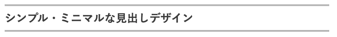
コードを表示する
.entry-content h3 {
  border-top: 2px double #333;
  border-bottom: 2px double #333;
  padding: 0.5em 0;
}
下のみに2本ボーダーライン

コードを表示する
.entry-content h3 {
  border-bottom: 2px double #333;
  padding: 0.5em 0;
}
上下に点線
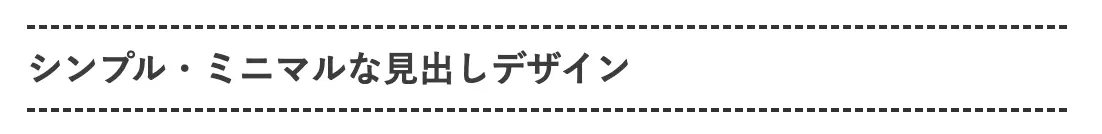
コードを表示する
.entry-content h3 {
  border-top: 2px dashed #333;
  border-bottom: 2px dashed #333;
  padding: 0.5em 0;
}
下のみに点線
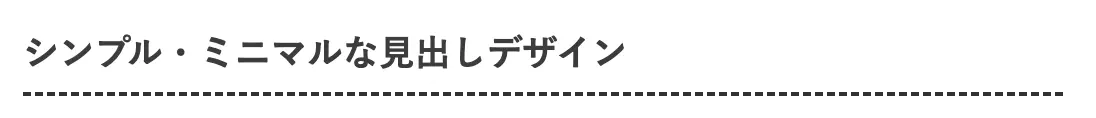
コードを表示する
.entry-content h3 {
  border-bottom: 2px dashed #333;
  padding: 0.5em 0;
}
左にボーダー

コードを表示する
.entry-content h3 {
  border-left: 4px solid #333;
  padding-left: 0.5em;
}
左にボーダー、背景色をプラスして付箋風に
コードを表示する
.entry-content h3 {
  border-left: 4px solid #333;
  background-color: #f0f8ff;
  padding: 0.5em;
}
テキストを中央揃え+短い下線

コードを表示する
.entry-content h3 {
  text-align: center;
  padding: 0.5em;
  position: relative;
}
.entry-content h3::after {
  content: "";
  position: absolute;
  bottom: 0;
  left: 50%;
  width: 30px;
  height: 2px;
  background-color: #333;
  transform: translateX(-50%);
}
左上と右下に四角形
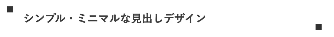
コードを表示する
.entry-content h3 {
  position: relative;
  padding: .5em 1.5em;
}
.entry-content h3:before,
.entry-content h3:after {
  content: "";
  position: absolute;
  width: 10px;
  height: 10px;
  background-color: #333;
}
.entry-content h3:before {
  top: 0px;
  left: 0px;
}
.entry-content h3:after {
  bottom: 0px;
  right: 0px;
}
かぎかっこ
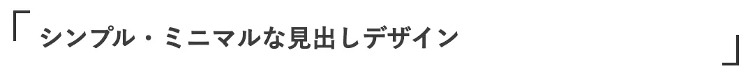
コードを表示する
.entry-content h3 {
  position: relative;
  padding: 0.5em 1em;
}
.entry-content h3:before {
  content: "";
  position: absolute;
  width: 10px;
  height: 20px;
  border-top: 2px solid #333;
  border-left: 2px solid #333;
}
.entry-content h3:after {
  content: "";
  position: absolute;
  width: 10px;
  height: 20px;
  border-bottom: 2px solid #333;
  border-right: 2px solid #333;
}
.entry-content h3:before {
  top: 0px;
  left: 0px;
}
.entry-content h3:after {
  bottom: 0px;
  right: 0px;
}
だいかっこ
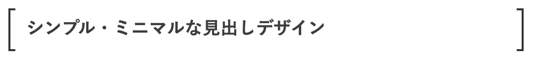
コードを表示する
.entry-content h3 {
  position: relative;
  padding: 0.5em 1em;
}
.entry-content h3:before {
  content: "";
  position: absolute;
  width: 5px;
  height: 100%;
  border-top: 2px solid #333;
  border-bottom: 2px solid #333;
  border-left: 2px solid #333;
}
.entry-content h3:after {
  content: "";
  position: absolute;
  width: 5px;
  height: 100%;
  border-top: 2px solid #333;
  border-bottom: 2px solid #333;
  border-right: 2px solid #333;
}
.entry-content h3:before {
  top: 0px;
  left: 0px;
}
.entry-content h3:after {
  top: 0px;
  right: 0px;
}
さらにカスタマイズしたいなら
ご紹介したデザインをさらに自分なりにカスタマイズしたい方に向けて、
- 各部の色
- 文字の配置(左・右・中央揃えなど)
のカスタマイズ方法を簡単に解説します。
oiCSSについて詳しくなくても簡単にカスタマイズ可能です!
色をカスタマイズする方法
色をカスタマイズしたい場合は、CSSコード内の「#のうしろの数字、もしくはアルファベット」を変更してみましょう。
例えば、「文字色」を変更したい場合は下記のコードを追記or変更します。
color: #333;
「背景色」を変更したい場合はこちらを追記or変更します。
background-color: #fff;
「ボーダーの色」を変更したい場合はこちらを追記or変更します。
border: 2px solid #333;
このシャープ記号のうしろ部分はカラーコードと言って、色を数字とアルファベットで表現したものになります。
好きな色のカラーコードを調べるなら、こちらのサイトがおすすめです。
文字の配置をカスタマイズする方法
文字を左揃え・中央揃え・右揃えに変更したいときは、こちらを追記or変更しましょう。
text-align: center;
デフォルトでは左揃えになっていますが、上記のコードを追記すると中央揃えにすることができます。
また、赤字部分を「right」に書き換えると、右揃えにすることができます。
本気でカスタマイズするなら
もっと自分なりにカスタマイズしたい!と本気で取り掛かるのであれば、HTML・CSSといったコードの知識を参考書で勉強することをオススメします。
ポチップ
終わりに
いかがでしたでしょうか。もし気に入ったデザインがあれば、コピペして試してみて下さい!
もしよろしければ、本記事をブログ内でご紹介してもらえると励みになります。
oi最後までご覧いただきありがとうございました!
コメント
コメント一覧 (12件)
素敵なデザインの紹介ありがとうございます。
さっそく使わせていただいたのですが、大見出し(h3)だけ見出しのテキストが表示されません。
h4、h5はうまくいきました。
リセットCSSも入れております。
h3では、左端に丸いマークと、上下にボーダーラインの2種類を試しました。
どうしたら、テキストが表示されるようになりましでしょうか?
再度コメント失礼します。
テキストは消えてしまったわけではなく、見出しラインの中で白文字として残っておりました。
白なので、見えなくなったということです。
コメントいただきありがとうございます!
差し支えなければ、適用中のテーマを教えていただけますでしょうか?
自分のはてなブログに同じテーマを適用して、h3のテキストが表示されるか確認したく思っています。
返信が遅くなりすみません。
使用テーマはSmooth(デフォルト)です。
自分のブログにも「Smooth(デフォルト)」を適用してみましたが、
・左端に丸いマーク
・上下にボーダーライン
の両方とも問題なく反映されました!
「カスタムCSS」に本記事以外のコードを記載されていたりしませんか?
テキストが消えたのではなく白文字として残っているとのことなので、h3のテキストカラーを白色に変更するコードがどこかに記載されていると推測しています。
もし原因のコードが無いようであれば、カスタムCSS内の一番下に以下のコードを追加してみてください。
h3のテキストカラーを黒色に変更できます。
.entry-content h3 {
color: #283030;
}
デフォルトデザインを試していただきありがとうございます。
h3のテキストカラーを白色に変更するコードがどこかに記載されているのではとのことでしたが、それを探すことが出来なかったので(なんかいろいろ入れてしまって)教えて頂いたテキストカラーを黒色に変更するコードを追加したところ、無事表示されるようになりました。
やはり、文字色が白になっていたのですね。
助けていただきありがとうございました。
無事に解決できてよかったです!
また何かありましたらお気軽に聞いてください^^
こんばんは。
先日お尋ねしたテーマ「Smooth(デフォルト)」の、大見出しを「上下にボーダーライン」から、「左端に丸いマーク」に変えてみました。
こちらのページの見本では、大見出しの2文字目まで丸が被るようになっていますが、私のパソコンでは、1文字目の右端がほんの少し丸からはみ出す形になります。
つまり、丸がだいぶん左にズレているのです。
それでもパソコンの場合は問題はないのですが、スマホの方だと丸の左側が少し切れてしまいます。
中見出しには「下のみに2色のボーダーライン」を使用させて頂いておりますが、そのラインの始まりと比べたら、丸の半分が左に飛び出しているようになっております。
これって、修正出来ますでしょうか?
自分のPC環境では2文字目まで丸が被るようになっています。おそらく別のコードが影響していると思われます。(h3の文字サイズが変更されている等)
スマホ表示時の左側の見切れ、丸の飛び出しについては、すみませんが自分の知識では対応難しそうです…
もうひとつ、「Color Book」というテーマのブログも立ち上げようと思っているのですが、そちらでは「左端に丸いマーク」が使えず、「1文字目を強調」を選びました。
できるならば、「左端に丸いマーク」が気に入ったので、そちらに変更したいのですが可能でしょうか?
このテーマでは使えないということであれば諦めますが。
自分のブログにも「Color Book」を適用してみましたが、丸が後ろ側に隠れてしまいますね…
色々試してみましたが難しそうです( ; ; )
申し訳ありません…
わかりました。
お手数おかけしてすみませんでした。